What is your visual brand and why it’s so important.
We all have brands that we feel ‘get us’ and who we feel happy to spend our money with. But this probably has more to do with how they make us feel rather than what they actually sell. A bit like a friendship, branding is about developing a relationship with your clients or customers.
Every company, large or small, needs a vision and purpose that people can relate to. Your values have to run through every area of the business, from recruitment to customer service. And also importantly, how you look.
How that personality is communicated to your customers visually, becomes your visual brand and it’s the most important piece of marketing you will ever do. It will form the basis for every future marketing, from leaflets, websites, exhibition stands to advertising and packaging.
Why is visual branding so important?
You know yourself the importance of branding… from Amazon’s A to Z smile, the iconic red of the Coca Cola can, to the powerful pull of the purple Costa signage (I’m a sucker for that one). A strong visual brand allows your customers to instantly recognise your messages, and treat them with a level of familiarity.
It also helps people to feel a connection with you and get a sense of whether you are someone they are likely to do spend their money with.
More than just a logo
I have clients who come to see me thinking that they have their branding sorted, as they already have a logo they are happy with. But a logo is just the pivotal starting point to a good visual brand. Everything from colour palette, fonts, tag lines, phrases, tone of voice, photography style, all have to be seamlessly connected.
I like your style
We all have favourite brands, and we all have a conscious or unconscious reaction to how they look, whether we know it or not.
We respond emotionally to how things look, we react to photographs before we read words, and colours can have associations that we have never actually thought about.
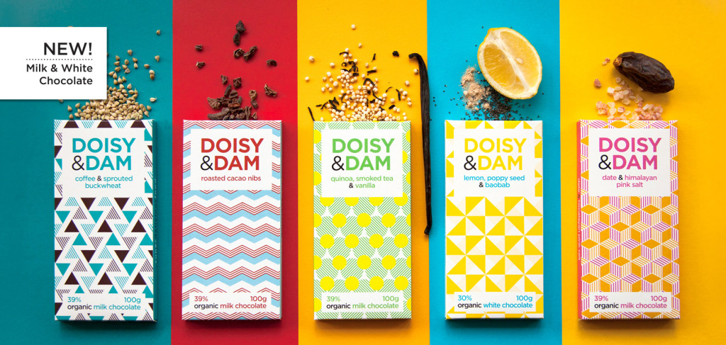
Personally I love the bright colours and geometric shapes of Doisy & Dam chocolate. Yes, the chocolate itself tastes damn good; but would I have tried it in the first place if the visual branding hadn’t pulled me in? Their fun, bright, contemporary personality and tone of voice is consistent across all their marketing and their brand values really connected with me.
So how do you want people to feel about your brand?
You want them to see you as a friend, but what type of friend? The reassuring, trustworthy friend? The warm, cuddly friend? Or the crazy, fun one that makes you laugh?
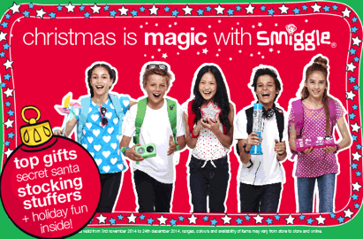
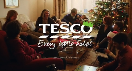
Take a look at these three Christmas ads for three different organisations (yes, I know that seems weird in April but stay with me). All great brands with very different looks appealing to very different markets.
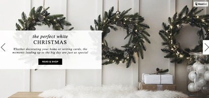
The White Company is very elegant and clean. The use of a stylishly inviting room setting is intended to appeal homeowners who are likely to invest in new homeware in time for Christmas.
Smiggle using bright colours and simple shapes is clearly aimed at young people and Tesco is going for the social family Christmas appeal. It’s unlikely that any of these styles would suit any of the others.
Brand consistency – Make sure they know it’s you
The reason why this is so important is that you have to love it enough to stick with it. Your brand must not only stand out, but your customers must know it well, often before reading any of the words, because they recognise it and feel familiar with it visually.
I once presented a client with three different design ideas for a logo. He said he loved them all. So much so, that he wanted to use all three! I had to gently explain that this would never work; people would be confused and unsure it was the same company. He finally understood when I explained the analogy that it is like not being able to choose between three dresses: but putting them all on at the same time is not the answer!
Similarly, it’s great to have lots of ideas, but not if you are going to use them all at the same time, making your exhibition banners look completely different to your website, or your social media posts. Think of it as a capsule wardrobe, where every piece is designed to look good with every outfit, rather than a jumble of things that cover a myriad of styles and don’t go together.
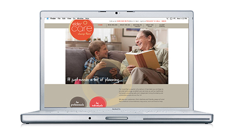
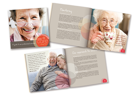
This is an example of consistent branding Othen Creative has designed for Eldercare. The brief was to create a warm, caring, personable brand that reflects the hands on and virtual care provided to their elderly customers.
What are the elements of a good visual brand?
Colour: A lot of work has been done on the psychology of colour in branding (So much that it really needs a blog of its own and more). But colour probably has the biggest impact on your visual brand.
What are your favourite colours? What speaks to you? What colours are used by your competitors or predominantly in your industry? All these questions are worth consider when choosing your brand colours.
The best brands have a select range of complimentary colours that work well together as a colour palette, rather than picking different colours for each piece of marketing.
Typography: Typefaces are also important. Serif or sans serif, upper case or lowercase, this all has an impact on your visual brand. One or two main consistent typefaces that you use across everything you do, is preferable to picking new fonts for every project.
Photography and illustrations: This may seem less obvious, but there are many different photographic styles out there and if your marketing uses photography or illustrations to enhance your message then having a outline of the style of these images can really help your visual brand style.
It’s crucial to get it right, and mistakes early on can have costly repercussions later down the line.
If you’d like to talk about transforming your company vision into a successful brand, drop me a line at steph@othencreative.co.uk


