Project Description
Pear Tree Living
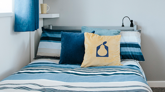
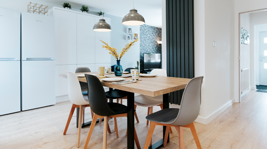
Pear Tree Living are a partnership of private residential sector landlords who provide high quality shared living for young working professionals in the Warwickshire and West Midlands areas.
They set up their business 2 years ago and since then, have been working hard to establish their business. They now have 3 large private residential properties of shared accommodation, with more opportunities coming soon.
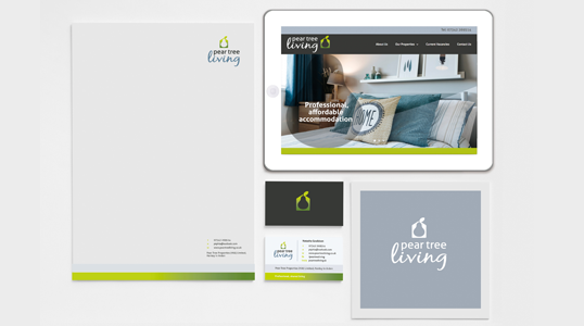
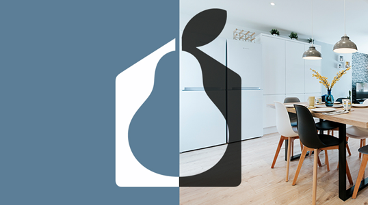
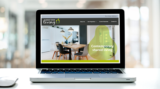
Up until this point they had been using a basic logo, so decided that now was the time to invest in establishing a distinctive brand identity and new name, as a basis for their digital marketing plans.
“Steph was really easy to work with, she listened to what we wanted and suggested some fantastic ideas. She supported us through every step of the decision process until we had our final design, which we are thrilled with.”
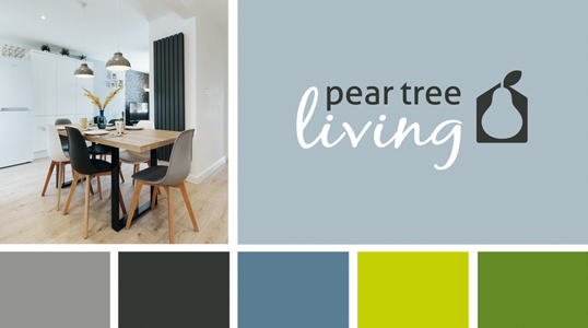
The brief in short was to create a warm, engaging identity using the visual references of the name and the housing sector they are in.
As with all my branding projects, a selection of different style routes were presented at the initial concept stage, then one design was selected for development and tweaking through to final artwork and brand colour stage.
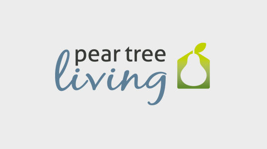
The final logo combines the simple symbol of a house, with a pear shape in the negative space within it. Meanwhile, the pear’s leaf morphs into the house shape, like a chimney.
The typography marries a modern sans serif font for ‘pear tree’ with a softer handwritten script font for the word ‘living’. The chosen colour palette uses fresh natural green hues with neutral greys.
