How to make large format and exhibition design work for your business.
Exhibiting for the first time at an event is big decision, but a great opportunity to introduce your brand to new people and to reconnect with people you already know.
It’s also one of the largest marketing investments you can make. Not only is there the cost of entry itself, staffing costs, and preparation time, you also need to give some thought to the design and production of your stand and what your message is going to be.
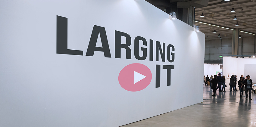
This is where your brand goes large.
Passersby will form an immediate judgement about your brand and your identity. Your stand (and brand) identity can be the difference between someone stopping to talk, taking some information or walking straight on by.
Too often, businesses do not give enough thought and planning to the design and content of their stand and this can have a significant impact on the overall results.

So here are our Top Tips for exhibition branding
1. Be consistent
Exhibitions are great for brand awareness and exposure. It’s essential that your branding is consistent across all your marketing. There is little point in making a great impression with an identity they really respond to, only to find that your website or print advertising looks completely different. Either they will be disappointed or won’t make the connection at all. If you’re thinking of rebranding, make sure this is done before you sign yourself up for lots of events and give yourself plenty of time to move all your materials across.
2. Consider it a long-term investment
Exhibition material can be costly so it’s important that you can get maximum use out of it. Can your large format branding also find a space in your showroom or reception area? Can it be used for future events or as a background to social media videos and posts? Thinking about its long-term use can help you get clarity on the design too.
That doesn’t mean that it has to be generic or bland, but think about the future.

3. Make the most of your space
Exhibitions will often vary in size and scale and the spend on stand design, build and installation can run into thousands. Therefore, it’s worth doing your homework. Work out where your stand is and how people will navigate around the venue. Will people approach you from the front or walk past you? Pay attention to people’s eyeline and you can dramatically improve your impact. Place your headline messages where they’ll have maximum visibility.
Many companies now prefer branded printed podiums and larger backdrops to a traditional table and print material layout. You can also have pods, curved backgrounds or comfortable seating. This may be a larger initial investment but if you’ve ever found yourself dragging home boxes of unused leaflets, you might see the benefit.
4. Keep it Simple
Large formats need to be designed with their size in mind. Keep your headline large and clear and don’t be afraid to choose just one message. They need to work both from a distance and close up, so bear that in mind when making decisions. Too much detail may get lost and limit its impact.
Instead, keep copy to a minimum and keep distinct images and text well-spaced. Research shows that faces attract more attention than any other image. Women, children and babies work particularly well, if you can find a way to work them into your brand. Food, animals and objects will also have more of an impact than natural landscapes and buildings which, unsurprisingly, tend to melt into the background.
5. Don’t forget the technicalities
Decorative fonts can easily blend into the background or fall apart when they are printed in large scale. Gradients of colour can look great on the screen but be careful as they can band together when you print them. Try to stick to blocks of colour or, if you must use gradients then try to keep the shade changes to a minimum.
6. Rules is rules
There are some general rules that are worth remembering, whether you are printing large or small. Light text on a dark background can be impactful as a headline but should be kept to a minimum and does not read well when used as small body text. The same applies to bright colours, particularly red, which works as a headline colour but never as small text. In most cases, less is usually more.
The small stuff
It’s easy to fill a table full of the usual stuff, but it’s worth thinking a little more creatively if you want to make a lasting impression.
Leaflets and Brochures
If your stand is a long term investment, your leaflets and brochures don’t have to be. Think about specific campaigns, messages and audiences you want to get across at a specific event and tailor them specifically. You don’t have to order a massive print run.
Postcards
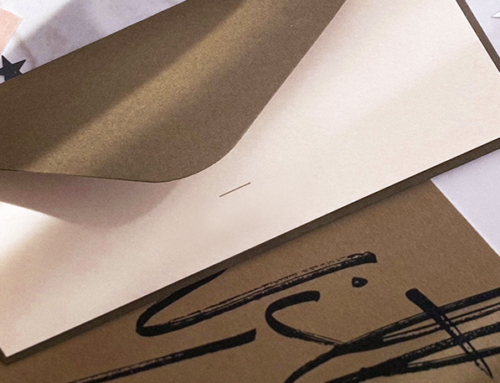
People will undoubtedly want to take away some information. How about some beautifully designed postcards? A variety of designs would add colour to the stand and represent your range of products or services. They could contain small amounts of information, or simply designed for customers to keep or use themselves.

Social media frame
This is a great way to get your brand found online. Ask visitors to take a photo in the frame and share with their network.
Cakes
Everyone loves a cake and rather than the typical bowl of celebrations, some cakes or biscuits with your logo on could make a tired and hungry delegate love you a little bit, and start a possible conversation that might lead to something more.
Think strategically
And finally, the most important part about exhibiting… strategy. What do you want to achieve from your hard day standing on your feet? Is it to collect new sign-ups to a mailing list? To arrange a certain amount of meetings with potential customers? Whatever it is, you need a goal. And a way of achieving that goal. Could it be a competition? Or a free giveaway in exchange for details? Whatever it is, give it plenty of thought, or all that time and money could be wasted.
If you are planning on exhibiting soon, we can help you talk through your ideas and design the perfect displays and promotional material for you, leaving you to concentrate on your smile and your pitch.

